Notice: Function _load_textdomain_just_in_time was called incorrectly. Translation loading for the acf domain was triggered too early. This is usually an indicator for some code in the plugin or theme running too early. Translations should be loaded at the init action or later. Please see Debugging in WordPress for more information. (This message was added in version 6.7.0.) in /www/apliqo_676/public/wp-includes/functions.php on line 6121

Notice: Function _load_textdomain_just_in_time was called incorrectly. Translation loading for the interactive-geo-maps domain was triggered too early. This is usually an indicator for some code in the plugin or theme running too early. Translations should be loaded at the init action or later. Please see Debugging in WordPress for more information. (This message was added in version 6.7.0.) in /www/apliqo_676/public/wp-includes/functions.php on line 6121

Notice: Function _load_textdomain_just_in_time was called incorrectly. Translation loading for the members domain was triggered too early. This is usually an indicator for some code in the plugin or theme running too early. Translations should be loaded at the init action or later. Please see Debugging in WordPress for more information. (This message was added in version 6.7.0.) in /www/apliqo_676/public/wp-includes/functions.php on line 6121

Notice: Function _load_textdomain_just_in_time was called incorrectly. Translation loading for the wp-cerber domain was triggered too early. This is usually an indicator for some code in the plugin or theme running too early. Translations should be loaded at the init action or later. Please see Debugging in WordPress for more information. (This message was added in version 6.7.0.) in /www/apliqo_676/public/wp-includes/functions.php on line 6121
Disjointed planning and analytics user interfaces? - Apliqo

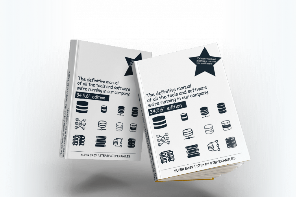
Your financial planning and analytics workflows involve various tools and software that all have their own steep learning curves

When a planning system involves too many moving pieces it can start to become unwieldy and challenging for users to use effectively.  There is always going to be a learning curve of course, but you want the interface to be as intuitive and cohesive as possible.  When it is disjointed and complicated, you rapidly decrease its usefulness because users will shy away from making the most of what is possible.

Your financial planning and analytics workflows involve various tools and software that all have their own steep learning curves.

When a planning system involves too many moving pieces it can start to become unwieldy and challenging for users to use effectively.  There is always going to be a learning curve of course, but you want the interface to be as intuitive and cohesive as possible.  When it is disjointed and complicated, you rapidly decrease its usefulness because users will shy away from making the most of what is possible.

How an overwhelming user interface stymies progress

It doesn’t matter how advanced your financial and operational planning technology is if the front-end that your users rely on is difficult to navigate and use.  A poorly designed interface will drastically reduce the amount of value you can get from your operations because it turns users off from engaging with the software and makes it challenging to complete tasks in a reasonable time frame.

So while it may seem purely cosmetic to some, the truth is that a user-friendly interface is a key factor in achieving planning and analytics excellence.  It’s the secret weapon that unlocks the power of the planning methodologies that underlie your system.

How an overwhelming

user interface stymies progress

It doesn’t matter how advanced your financial and operational planning technology is if the front-end that your users rely on is difficult to navigate and use.  A poorly designed interface will drastically reduce the amount of value you can get from your operations because it turns users off from engaging with the software and makes it challenging to complete tasks in a reasonable time frame.

So while it may seem purely cosmetic to some, the truth is that a user-friendly interface is a key factor in achieving planning and analytics excellence.  It’s the secret weapon that unlocks the power of the planning methodologies that underlie your system.

Apliqo's user interface stands out from the rest

We made our name in the IBM Planning Analytics with Watson (TM1) space by creating a user interface that is accessible to everyone without compromising on data quality, features, or complexity management.  It is highly visual, focused on the things that really matter, and it doesn’t require weeks of training to get up and running.  All of this is on purpose because we want it to be as approachable as possible.

When you run all your planning and analytics in Apliqo you never have to worry about your team members missing out on the best features.  The interface is set up to encourage best practices across every aspect of the workflow.  It’s so simple that you might even forget just how complex things are under the hood.(

Apliqo's user interface

stands out from the rest

We made our name in the IBM Planning Analytics with Watson (TM1) space by creating a user interface that is accessible to everyone without compromising on data quality, features, or complexity management.  It is highly visual, focused on the things that really matter, and it doesn’t require weeks of training to get up and running.  All of this is on purpose because we want it to be as approachable as possible.

When you run all your planning and analytics in Apliqo you never have to worry about your team members missing out on the best features.  The interface is set up to encourage best practices across every aspect of the workflow.  It’s so simple that you might even forget just how complex things are under the hood.

Get the best user interface on the market. Try Apliqo FPM.

Book a call today and we can show you why Apliqo’s user interface stands out from the rest.

Faber Castell logo
Häfele logo
Ardex logo

We’re proud to have helped these companies plan better.

Get the best user interface on the market. Try Apliqo FPM.

Book a call today and we can show you why Apliqo’s user interface stands out from the rest.

Faber Castell logo
Häfele logo
Ardex logo

We’re proud to have helped these companies plan better.

Recent articles from the Apliqo FP&A blog

Leveraging Alternative Data

Leveraging alternative data: transforming FP&A with non-traditional insights

This article explores how financial planning and analysis (FP&A) professionals can leverage alternative data sources — such as social media sentiment, satellite imagery, web scraping, and geolocation data — to enhance traditional financial metrics and gain competitive advantages. Through a retail case study, technological enablers like AI and real-time analytics, and practical implementation strategies, the article demonstrates how non-traditional insights can transform financial forecasting, improve decision-making agility, and help organisations navigate market uncertainties despite integration challenges.

Read More »

Recent articles from

the Apliqo FP&A blog

Supply chain: Managing volatility — FP&A strategies in a complex global market

One of the most prevalent modern challenges for large-scale organisations is supply chain volatility. Factors such as geopolitical tensions, trade disputes, fluctuations in commodity prices, and unexpected disruptions in logistics can quickly derail even the most carefully crafted financial plans.

Read this article
supply chain

Leveraging alternative data: transforming FP&A with non-traditional insights

This article explores how financial planning and analysis (FP&A) professionals can leverage alternative data sources — such as social media sentiment, satellite imagery, web scraping, and geolocation data — to enhance traditional financial metrics and gain competitive advantages. Through a retail case study, technological enablers like AI and real-time analytics, and practical implementation strategies, the article demonstrates how non-traditional insights can transform financial forecasting, improve decision-making agility, and help organisations navigate market uncertainties despite integration challenges.

Read this article
Leveraging Alternative Data

Big data: Opportunities and Challenges for FP&A

Imagine stepping into an immense, ever-evolving digital library where every piece of data is a book waiting to reveal a hidden secret about your business. In the realm of financial planning and analysis (FP&A), big data is that library — a vast, intricate repository that can transform routine forecasts into dynamic, actionable insights.

Read this article
Big Data

Financial Health Check: How to prepare your Q1 diagnosis

We are now well into Q1 of the new year and as such, it’s the perfect time to conduct an annual financial health check – much like a routine physical examination that ensures your body is running at peak performance. Just as you shouldn’t skip your yearly check-up, neglecting a comprehensive review of your organisation’s financial wellbeing can leave you exposed to unforeseen risks.

Read this article
Financial Health Check

Variance Analysis — Its art and science

Variance analysis is both a technical discipline and a nuanced craft. In the world of FP&A, it is the process of comparing planned outcomes with actual results, identifying discrepancies, and uncovering the underlying causes. While the scientific aspect involves quantitative methods and precise calculations, the art lies in interpreting these figures in context and making judgements that drive strategic decisions.

Read this article
variance analysis